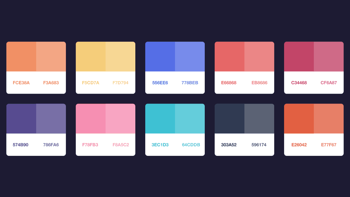
Color harmony
Color harmony refers to the pleasing arrangement of colors in a way that is visually appealing. It involves combining colors in a manner that creates a sense of balance and unity. Color harmony can be achieved through various color schemes, such as complementary colors, analogous colors, triadic colors, split-complementary colors, tetradic colors, and more.
Here’s a brief overview of some common color harmony schemes:
-
Complementary Colors: Colors that are opposite each other on the color wheel, such as red and green, blue and orange, or yellow and purple.
-
Analogous Colors: Colors that are adjacent to each other on the color wheel, such as yellow, yellow-green, and green.
-
Triadic Colors: Three colors that are evenly spaced around the color wheel, such as red, yellow, and blue.
-
Split-Complementary Colors: A variation of the complementary color scheme where instead of using the direct complement of a color, you use the two colors adjacent to its complement. For example, if the complement of blue is orange, you might use blue with yellow-orange and red-orange.
-
Tetradic Colors (Double Complementary): A scheme that uses four colors, consisting of two complementary color pairs. This can result in a vibrant and dynamic palette.
Color harmony is often used in various fields, including art, design, fashion, interior decoration, and graphic design, to create visually pleasing compositions and evoke specific emotions or convey certain messages. Understanding color theory and different harmony schemes can help artists and designers make informed decisions about color usage in their work.
« Terug